Weekly Theme: As an extension of last week’s investigation into the way images are used for storytelling and commentary purposes, our third brief encouraged us to explore another form of narrative imagery - comics. Commonly featured in magazines and newspapers, comic strips use a series of inter-related, sequential illustrations to communicate a story to the reader (Male 2007, 158). Our weekly tutorial gave us the opportunity to discuss the importance of layout, frame selection and the use of character expression, as well as practice drawing our own comic strips using visual techniques such as word balloons and hites to communicate a story to the reader. Resultantly, this week’s brief involved creating our own narrative comic strip, producing one panel per day so as to have a completed 5 panel comic strip by the week’s end. As comics vary greatly in terms of audience, narrative genre and illustrative style, the brief allowed us the freedom to illustrate our chosen story in whatever style we saw fit. We were however required to include colour in our comic strips, thus eliminating noir as a potential style.
Inspiration: As I personally prefer Western-style comics; particularly those with a simple aesthetic and minimal background detail - as opposed to the Eastern anime style, I decided that I would take a similar approach when it came to illustrating my comic. Resultantly, the inspiration for my chosen style came from the infamous Peanuts comic strips, written and illustrated by American cartoonist Charles, M. Schulz. I have always admired the simplicity of his comics and the way in which he constantly employed the same illustrative style for all of his characters, thus establishing and maintaining visual continuity. Schulz’s work is also a prime example of how comic symbols (i.e. hites) and a character’s facial expression can be instrumental in conveying the meaning behind the illustration. Furthermore, with the character in my chosen story being a young boy similar in age to Charlie Brown and the other Peanuts characters, I used these characters as a source of inspiration when developing my own.
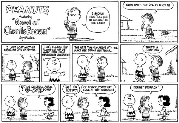
Source: Schulz, Charles M. 1969. “February 2, 1969”. Image. Accessed August 28, 2016. http://peanuts.wikia.com/wiki/February_1969_comic_strips
Title: Panel 1 (Image #13)
#oneimageperday

Title: Panel 2 (Image #14)
#oneimageperday

Title: Panel 3 (Image #15)
#oneimageperday

Title: Panel 4 (Image #16)
#oneimageperday

Title: Panel 5 (Image 17)
#oneimageperday

Completed Comic Strip

As all five images belong to the one comic strip, the source of inspiration and the reasoning for my design decisions, along with the technique and process used is the same for each. Hence, this week’s explanations and reflections have been combined into a single, yet extended, written piece.
Inspiration: Having undertaken a practice activity in our tutorial class that required us to create a comic that told a story from our childhood, I was inspired to continue with a similar theme when choosing the particular story I wanted to illustrate. Hence, the inspiration for my 5 panel comic strip came from an infamous family story that is continually retold at family gatherings at the expense of my younger brother (the main character), who was only four years old at the time. My parents, who started to grow some of their own vegetables, planted a tomato vine in a pot in our backyard. With my brother and I aged four and six respectively, my parents were sure to instruct us not to pick the tomatoes until they turned red in order to protect their new venture from potential raiders and ultimately, maximise its chance of success. One day, the temptation of the tomato plant proved too strong for my brother who decided that picking one tomato would be of no real consequence. Unfortunately, Mum caught him in the act and, in an effort to teach him why it was so important to leave the tomato to ripen, made him eat the green tomato he had just picked. Whilst I adapted the story slightly for the purposes of the task, clear parallels such as the age and depiction of the main character, the climax or punchline (picking the unripe tomato) and the resulting reaction can be drawn between the original story and my featured comic strip.
Technique: Hand-drawn illustration, cartooning, and digital imaging. Media: HB pencil, 0.1mm Copic Multiliner, Copic Multiliner Brush Tip Pen. Digital Imaging Software: Adobe Photoshop and Adobe Illustrator.
Process: As explained above, each panel was made by following the same process and therefore began with a rough pencil sketch in my sketchbook that allowed me to experiment with and refine my illustration style. When satisfied with my sketches, I outlined them using a black ink pen before using a DIY light-table to transfer them onto bleed-proof paper. I then scanned each image and imported them to Photoshop where they were converted to greyscale (achieved via converting the existing profile to Working Grey – Dot Gain 20%), and edited to appear as a stark black and white image, by increasing both the brightness and contrast. The next step involved using the Brush tool to paint in any missing details (i.e. where my ink lines may not have been properly touching) and the Eraser tool to remove small mistakes and bleeds. Each image was then placed in Illustrator, traced using the Live Trace function and expanded to create a vector image. This then allowed me to use the Live Paint Bucket to colour each image as desired.
Reasoning: As I only had five panels in which to tell my story, it was essential that I choose my five feature ‘events’ carefully and utilise visual techniques that best established its context and allow for its meaning to be easily understood. With this in mind, I chose to begin the story with the boy already standing in front of the tomato plant, as opposed to him walking towards it or spotting it in the distance so I could then utilise the remaining four panels to illustrate the other key events that were required for the story to make sense. I elected to split the third panel in two as this allowed me to show the boy looking over both shoulders for potential witnesses before picking the tomato. By juxtaposing them side by side within the one panel, the meaning behind this action is clearly explained to the reader. I also chose to vary the scale of the second and fourth panel so as to place emphasis on important details that might have otherwise gone un-noticed, had they been drawn from the same wide angle as the other three. The style in which I illustrated the boy was purposefully intended to communicate his age and subsequent lack of life experience to the reader and the fact that the tomato plant is of a similar height supports this representation. I drew the boy from a side angle in panels 1, 3, and 5 in order to show that he is clearly looking at and interacting with the tomato plant. I also added a speech balloon in Panel 1 to illustrate his interpretation of the scene and ensure that audiences can clearly understand what type of plant is featured, radial lines in Panel 4 to illustrate that the tomato had been picked from the plant and motion lines in Panel 5 to elucidate the boy’s reaction to having tasted the unripe tomato. Whilst I added colour to several elements in each panel, I chose to leave the background white as it not only aligns with my chosen illustration style but also ensures the viewer is immediately drawn to the action depicted in each panel.
Reflection: I definitely enjoyed the process of creating a comic strip as it allowed me to explore a domain of illustration that I had not previously worked in and challenged me to experiment with a new illustration style. As someone who usually draws still life images that feature a high degree of realistic detail, I relished the opportunity to trial a more simplified, stylised cartoon style. The task also exposed me to the wonders of the Live Paint Bucket, a tool in Adobe Illustrator that I hadn’t previously been aware of but will be sure to use in future projects. Aside from actually choosing the five events that would feature in the strip, I found maintaining visual continuity across each panel to be rather challenging. It took great care and concentration to ensure that there were no obvious inconsistencies between the panels and simple details such as the boy’s height, the positioning and direction of the plant’s leaves, and the number of lines used to represent the grass was kept the same throughout the series. Although this proved to be quite tedious, I am satisfied with the overall result and believe that my minimalistic style and colour scheme is well suited to the subject and context of the story.

